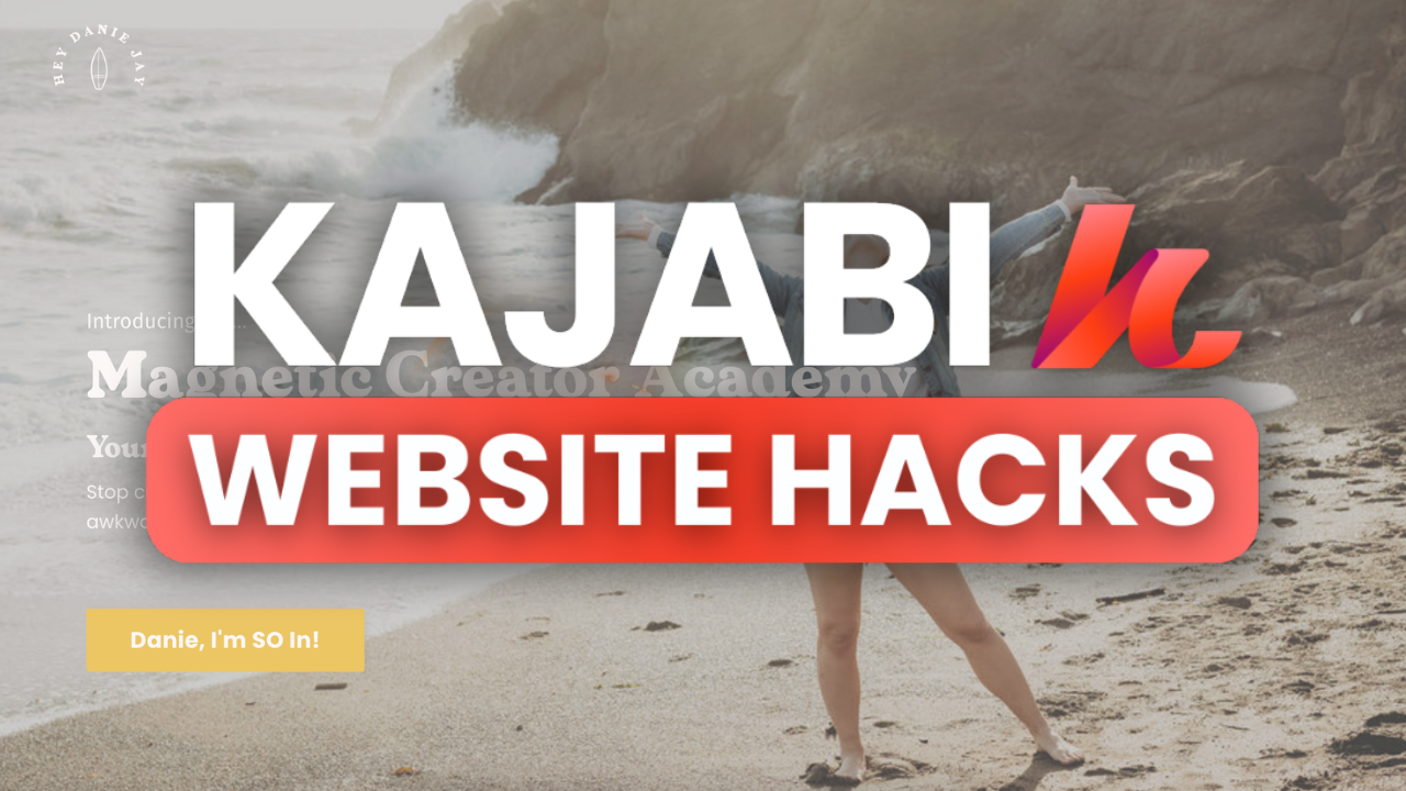
7 Underrated Kajabi Website Design Hacks for a Beautiful Website

Trying to build a website in Kajabi that actually looks good? Or maybe you launched something and you’re like… why does this look so meh?
As someone who built a multi-6-figure coaching business using Kajabi, I (hi, I’m Danie!) know the struggle of making your website look just right. You don’t need to be a web designer or spend 100 hours obsessing over the layout—you just need the right hacks.
In this post, I’m sharing 7 underrated tips to help you build a beautiful Kajabi website—especially if you’re just starting out or feeling stuck with your current design. These work whether you're focused on sales pages, homepages, or about pages.
What’s the Difference Between a Website and a Landing Page in Kajabi?
Before we dive into the design hacks, quick note on what Kajabi calls a “website” vs a “landing page.”
- Website pages = show up in your navigation and share general info (home, about, contact)
- Landing pages = built for specific goals like launching a product, building your list, or running a promo
Both are technically part of your website, but they function differently.
And real talk? I honestly believe you don’t even need a full-blown website anymore—you need strong, strategic landing pages.
That’s why I’m focusing on landing pages in this post. But these tips will still apply to your homepage and about page too.
P.S. If you want a full breakdown on how to build a sales page watch this video!—I even give you a plug-and-play sales copy template.
7 Kajabi Website Design Hacks for a BEAUTIFUL, Professional Website
1. Make Your Photos “Fixed”
When you scroll and the image stays put? That’s a fixed image—and it instantly gives your site a more premium, expensive vibe.
To do it:
- Add a background image to a section
- Under background settings, choose “Fixed” position
Boom. Instant upgrade.
2. Use Pexels or Apply the Same Filter to All Photos
Your site looks more cohesive when your images actually match.
- Use Pexels.com for free, high-quality images
- Or apply the same Lightroom preset or Canva filter to all your photos so the colors flow together
Aesthetic consistency = ✨chef’s kiss✨
3. CTA Button Hacks
Your CTA (call-to-action) is one of the most important parts of your site. Here’s how to level it up:
- Make buttons link to a section on the page (use anchors—it keeps things smooth)
- Keep all CTA buttons the same color—your brightest accent color works best
- Make your CTA open in a new tab to keep people on your page
It’s these small tweaks that make your page feel more professional (and get more clicks).
4. Add Your Branding Colors to Kajabi Settings
Don’t pick colors every single time.
Go into:
Settings → Site Details → Branding
Input your brand hex codes once, and Kajabi will autofill them everywhere else. Time-saver and brand consistency? Yes please.
5. Add a Custom Font to Your Site
Kajabi doesn’t support every font—but there’s a workaround!
If you have a font you use in your branding (like my font, Wanderlust), here’s how to add it:
- Buy the font on Creative Market
- Upload it to a custom landing page (called an Assets Page)
- Use Kajabi’s custom font tutorial
This gives your site that extra brand personality that sets you apart.
6. Add SEO + Social Sharing Info
Want your website to show up in Google and look cute when shared on social?
You gotta fill in:
- Page Title
- Meta Description
- Social Sharing Image + Text
Go to:
Pages → Edit Page → SEO & Sharing tab
Add something like “Magnetic Creator Academy” as the title if that’s your brand—make it easy for people to find you.
7. Simplify Everything
Honestly? Most Kajabi pages are way too busy.
- Too much text
- Too many images
- Too many buttons
👉 Ask yourself: What’s the main goal of this page?
If it’s to sell a course, build your list, or book a call—everything on the page should point to that.
Remove distractions. Cut the fluff. Keep it simple.
Simple sells.
Final Thoughts
You don’t need to spend hours on code or hire a designer to make your Kajabi website beautiful.
Sometimes, all it takes is a few layout tweaks, a solid color palette, and some intentional spacing.
If you found these tips helpful, make sure to bookmark this page or share it with someone working on their Kajabi site.
👉 Don’t forget to grab your Kajabi 30-day free trial and get my Zero to $10K Course Sales Roadmap instantly.
You might also like:
FAQs
- Do I need to use custom code for these hacks?
Nope! Everything mentioned here can be done using Kajabi’s built-in tools. But feel free to enhance things with light code if you’re comfortable. - Will these design tips work on all Kajabi themes?
Yes, but some elements (like padding control or full-width layout) might vary slightly based on your theme version. - Can I undo these changes if I don’t like the result?
Absolutely. Kajabi lets you revert changes or duplicate sections before editing—so you’re safe to experiment!
This Post Was All About 7 Hacks to Build a BEAUTIFUL Website in Kajabi (You Didn't Know!)
Stay connected with all Danie's tips and tricks!
Join my mailing list to receive YouTube tips, encouragement, and personal branding hacks.
We hate SPAM. We will never sell your information, for any reason.
